Productivity & Collaboration Tools Microsoft Office 365 Excel 365
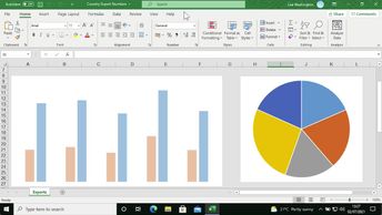
Present your Excel 365 data visually by using charts. Excel features several built-in charts, each of which can be customized to suit your needs. In this course, you will learn how to insert charts and add charts quickly with the Quick Analysis tool. You will explore how to create a bar chart, pie chart, line chart, and add chart labels. This includes adding a chart title and data labels, and discovering how to present negative values in a chart. Finally, you will explore how to apply basic formatting, such as default colors, to your charts.
| Objectives |
|---|
Excel 365: Getting started with charts
|